Highlight the Performance on a Geographical Map
Business Problem
You would like to create a dashboard of Sales Performance for different locations, highlighting the high-performing and low-performing locations on a map. A map visualization will occupy less space on dashboard while showing lot of information.
Components
Requirements
To accomplish this task, we need to have:
- The right to create a Professional space
- Birst Visualizer access (for creating a report)
- Edit Dashboard right (for adding the report to the dashboard)
- If you are using an Infor Cloudsuite, you can find the corresponding IFS roles in the CloudSuite Analytics documentation. For example, in M3 Analytics you need the ‘M3A Administration‘ role for Visualizer and Edit Dashboard access
- Data containing a Geo Attribute, i.e. Country, City, State (for USA), Geo Coordinates (Latitude and Longitude), etc.
Tutorial
Difficulty: Easy
Estimated Completion Time: 15 minutes
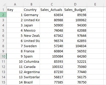
Let’s assume we have a table from an Excel file where one column represents the Country, and the other two columns represent the Actual Sales and Budget Sales as shown below:
1. Importing the Data
After we have logged in, we go to our Birst Space (or create a new Professional space) and then import the Excel file into Birst in the ‘Connect’ phase. Instructions for uploading the Excel file are included in this video on the official Infor channel.
Simply put, the steps are:
- Connect to the Excel file & upload it
- Ensure the data is correct
- Import the data

2. Preparing the Data
Then, we move to the Prepare phase. This is where we clean up the data, or add calculations and scripts. For the sample data there is no need to do any Prepare actions.
3. Relate
In Relate, we create connections, or joins, between data sources, if necessary.
You can see how Relate works in the following video:
The next step is to publish the data from the Staging Tables into the Data Model using the ‘Publish’ icon.
4. Creating the Geomap Report
Once the data is published, we go to the Visualizer and create a Geomap Report.
We choose a measure, which in our case is ‘Sales_Actuals’ and a Geo attribute which in our case is ‘Country’. For the Geo Attribute, Birst prompts the user to select the most suitable option.

5. Conditional Formatting
We then configure the Conditional Formatting specifying the criteria and the color coding. In this example, we specify a condition where the location is colored green if Sales Amount is greater than the Budgeted Sales. Otherwise, it is red.

The resulting visual highlights the regions accordingly enabling the user to quickly focus on the regions needing attention.
The tutorial is for a Professional space, but you can of course do the same with data in an Enterprise space.
Resources
Infor Birst How-To Series – Connecting to Files
Infor Birst How-To Series – Prepare in a Professional Space