Changing visualizations based on user selection
Business Problem
You have a dashboard that displays the correct information, but in some situations the user would like to analyze the data from different perspectives using different visualizations. You would like to give them a selection option on the dashboard to choose the visualization they desire.
Components
Requirements
- Edit Dashboard right (for dashboard filter editing)
- If Disable Filter Edit Access permission is enabled, the user can only create and edit Local Filters.
- If you are using an Infor Cloudsuite, you can find the corresponding IFS roles in the CloudSuite Analytics documentation. For example, in M3 Analytics you need the ‘M3A Administration‘ role for Edit Dashboard access.
Tutorial
Difficulty: Easy
Estimated Completion Time: 15 minutes
The Birst View Selector allows a user to switch between the original chart and a table view in a dashlet. Dashboard creator enables or disables the View Selector for each dashlet. Depending on how many measures and attributes your original chart uses, the View Selector will have a different number of chart options available.
However if you want to include a map view, or to switch between reports and charts that hold a different data set, you need a different approach.
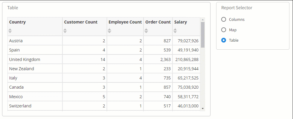
By setting up a filter that controls which reports are visible you can give the user a way to easily switch between reports right on the dashboard.
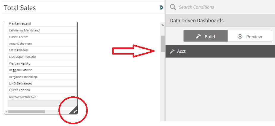
You can use ‘Data Driven Dashboards’ to overlay different dashlets on top of each other and show/hide them using a dashboard filter.
Showing and hiding dashlets (reports, KPIs, images) enables the user to change the way they analyze data while staying on a single dashboard. Based on selections made on in the filters the reports can be shown or hidden, changing the design of the whole dashboard.
1. Create a Mandatory Filter
Create one or more mandatory filters as parameters that will deliver specific values to the condition.
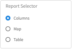
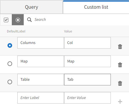
In the video below we create a filter called ‘Report Selector’ that will display three options: Map, Table, and Column.
Each option is mapped to it’s own value Map → Map, Table → Tab, Columns → Col. These values are the output of the filter.
We change the filter from ‘Multiple’ to ‘Single’ selection so that it produces only one result, and we set it to ‘Mandatory’ so that one of the options is always selected, even when the page loads.
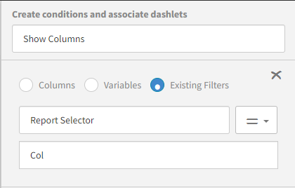
2. Create the Condition
Create conditions that use the values from the parameter filters.
‘Data Driven Dashboards’ allow us to show and hide any dashlet on the dashboard based on a condition.
In the video below we create a condition called ‘Show Table’, and we connect it to the filter we created earlier called ‘Report Selector’.
The condition uses the output from the filter, and when that output is equal to ‘Tab’ then the condition is true.
Add reports, KPIs or any dashlet to the dashboard, and associate the conditions to the dashlet by first clicking the condition, and then the dashlet. You will see a ‘hammer’ icon on the bottom right corner of the dashlet associated with the condition.
As long as the condition is true the associated dashlet will be shown. Once the parameter filter is changed the condition will become false and the dashlet will hide.
3. How the Filter works
The user will make a selection on the embedded filter.
Based on the users selection the filter will generate the corresponding parameter.
And the condition will be either True or False.
If the condition is true, the associated dashlets will be visible, otherwise they will remain hidden.
Resources
How to set up Dashboard Filters
How to setup Data Driven Dashboards
Basic Dashboard Filtering in the Birst How-to series on YouTube
Advanced Dashboard Filtering in the Birst How-to series on YouTube